
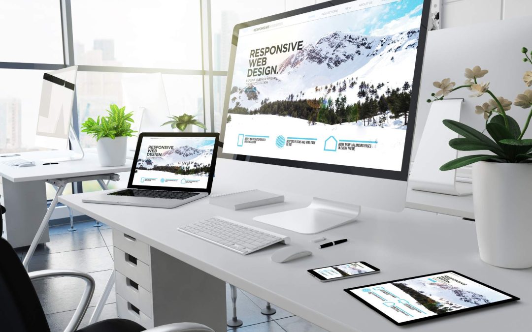
Now that real world internet browsing can be done on multiple screen sizes, responsive websites rule. On today’s internet, mobile-friendly websites are given priority. Google has raised the bar for the way the internet determines the importance of your website. I built my first website in 1998 before most businesses and consumers possessed personal computers linked to the internet. A generation has barely passed and today’s indispensable accessory for browsing the net is a smartphone with a 5 inch screen. In between we have viewed websites on fat square CRT monitors, wide rectangular gaming computer monitors and large living room vision televisions connected to Web-tv.
Google has positioned itself as the gatekeeper of the web. The world’s most relevant search engine now serves a different set of search results to smart phone browsers. If your website is not optimized for these consumers, your website will appear behind responsive site links. There is a process to follow now to get visibility on Google. There is a learning curve, and it is not something the average small business owner has the time to delve into.
Today high-speed internet and ubiquitous wi-fi is available to anyone. It’s okay to utilize photography, parallax displays, slideshows and embedded videos to make your company website a beautiful and effective marketing tool.
Today responsive websites Rule. To build a company website optimized for all media screens, give Nott Marketing Services a call at 860-774-4467.